There are many types of TestCase charts we can create in Azure DevOps to see the Test Case Execution Data. Let us see what are those Test Case Execution charts by following the below steps
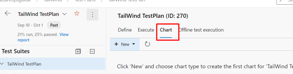
Step1 : Go to TestPlans and select the TestPlan for which you are going to see the Execution data
Step 2: Click on “Chart” on the right pane as shown below
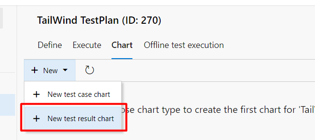
Step 3: To see the Test Result in the chart form, Click on the New button and then choose “Test Result” as shown below
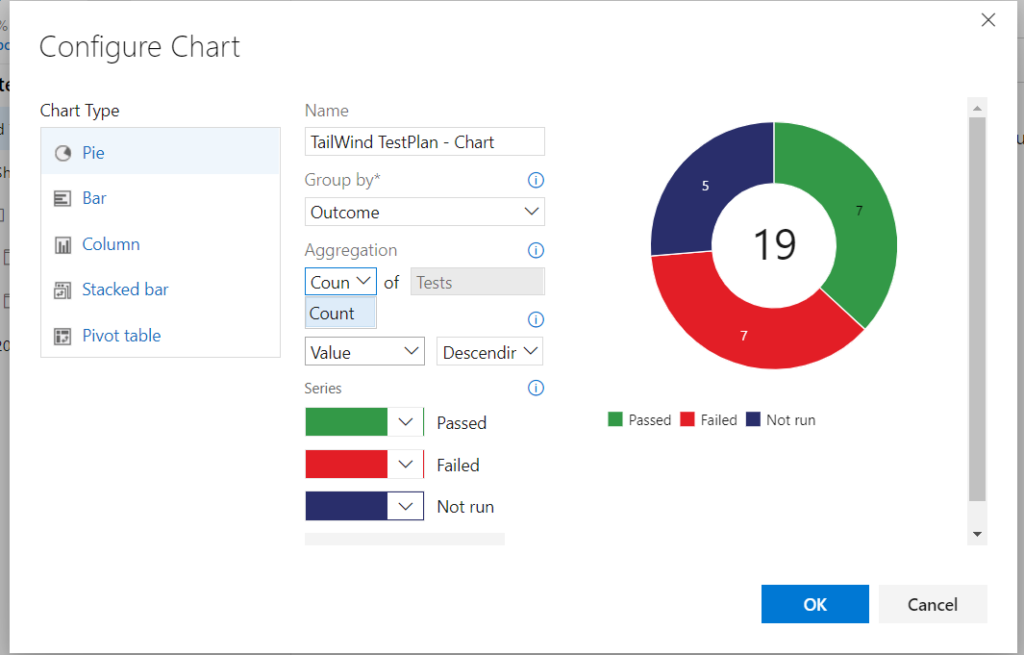
Step 4: Here you can choose different types of chart as well group by different fields also as shown below
Pie Chart: Once you click on “Ok” button , the pie chart would be displayed as shown and different colors can be choosen for different series
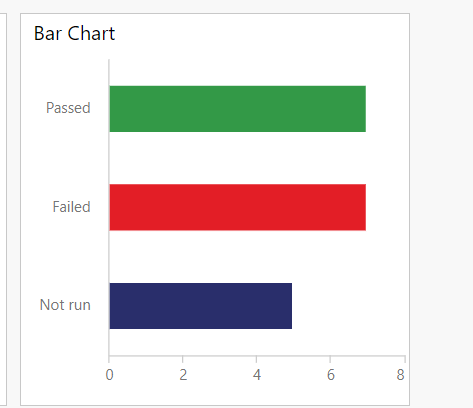
Bar Chart
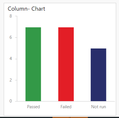
Column Chart:
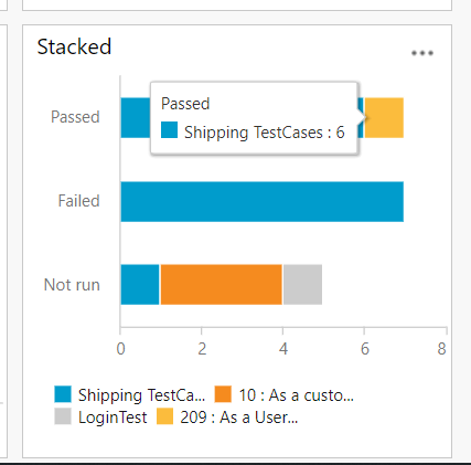
Stacked Chart
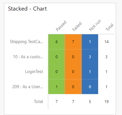
Stacked Chart
These are the different types of charts that can be created for Test Execution Result. These charts can be also created for Test Suites by following the same steps as described above…